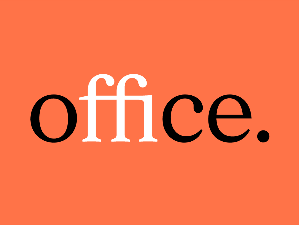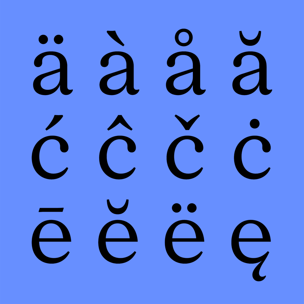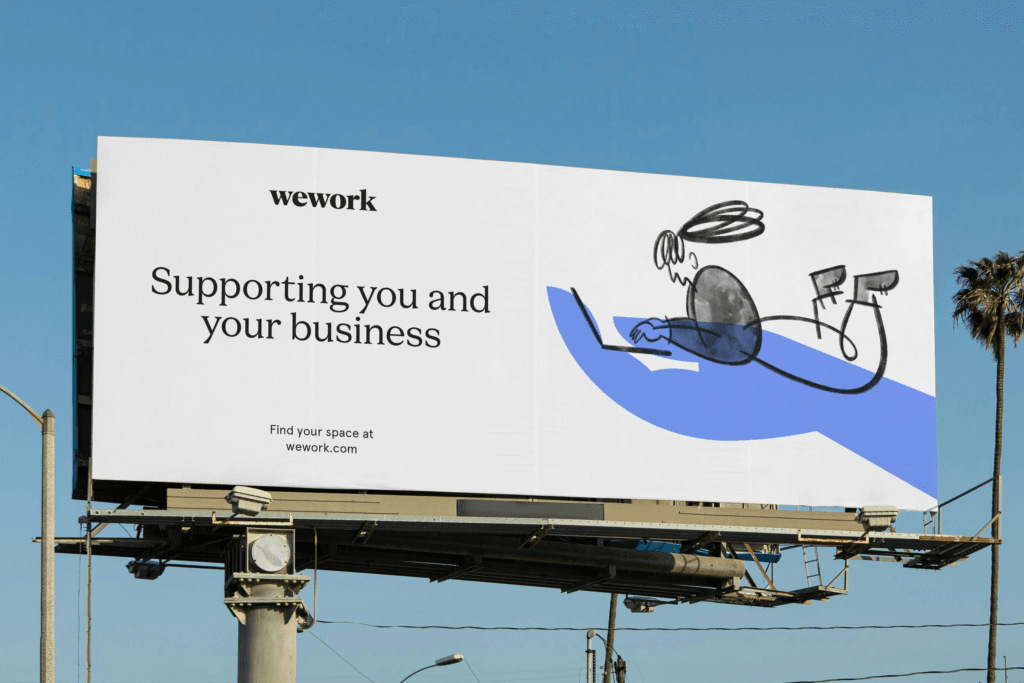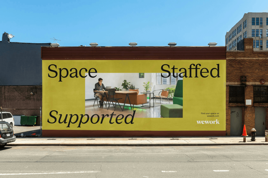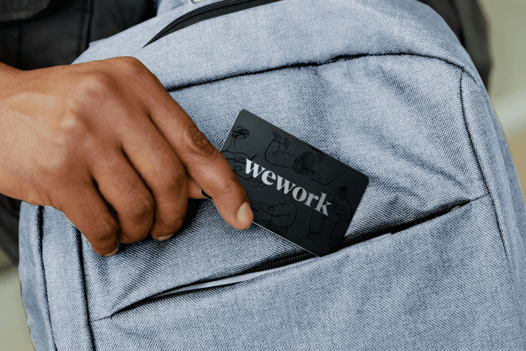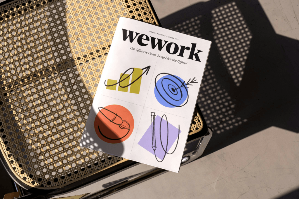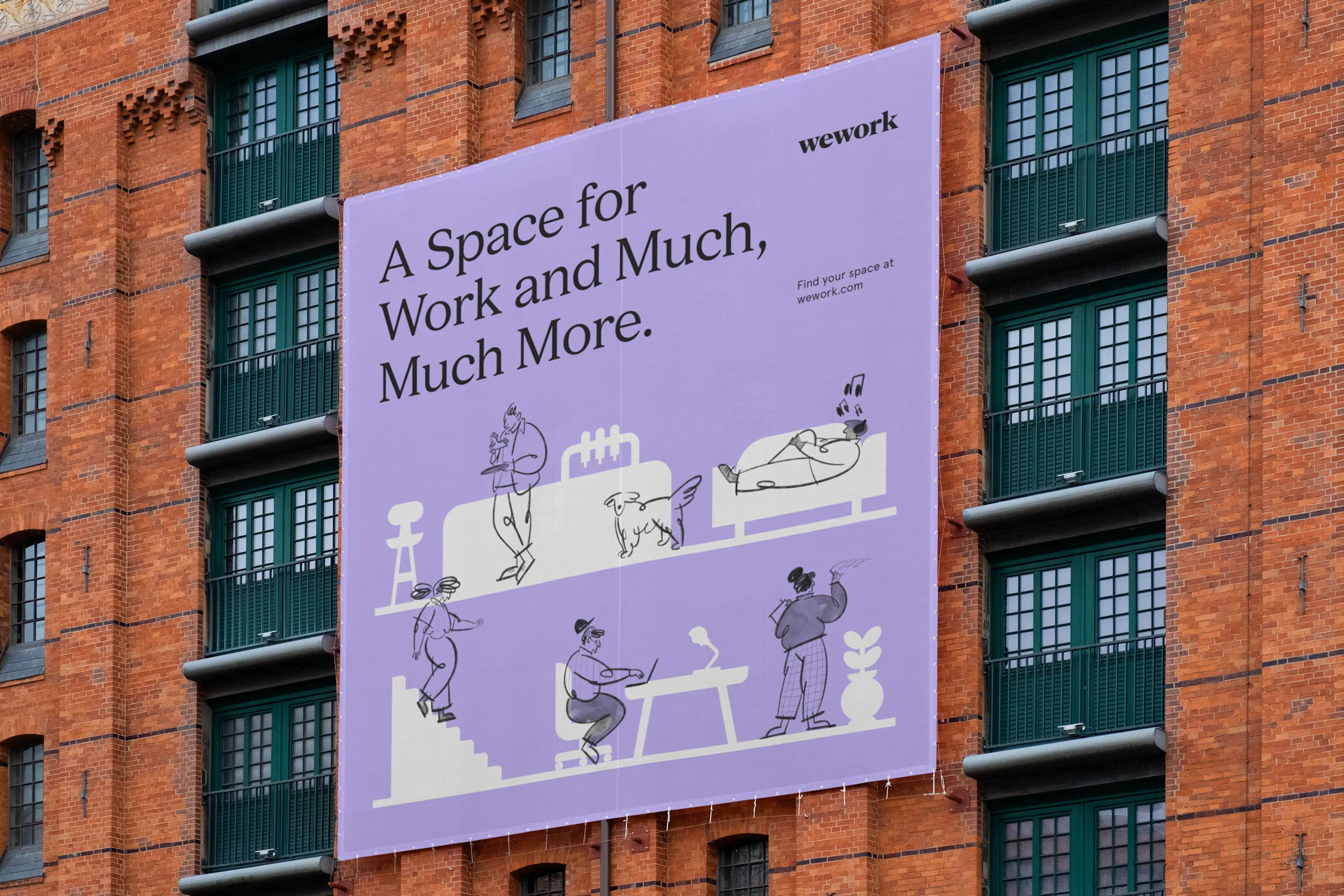
WeWork partnered with Franklyn to shed its founder-centric narrative and refocus on member empowerment. The rebrand merges institutional authority (“we”) with individual creativity (“you”) through a layered visual system of modern symbols and doodle-like illustrations, anchored by a custom typeface (WeWork Serif) co-developed with A+. Scalable design tools ensure global consistency across 300+ locations, while art direction balances sophistication and warmth, enabling local teams to adapt the brand for diverse markets without losing coherence.