Apfel Grotezk Font – A Friendly Sans Serif with a Sustainable Twist
Overview
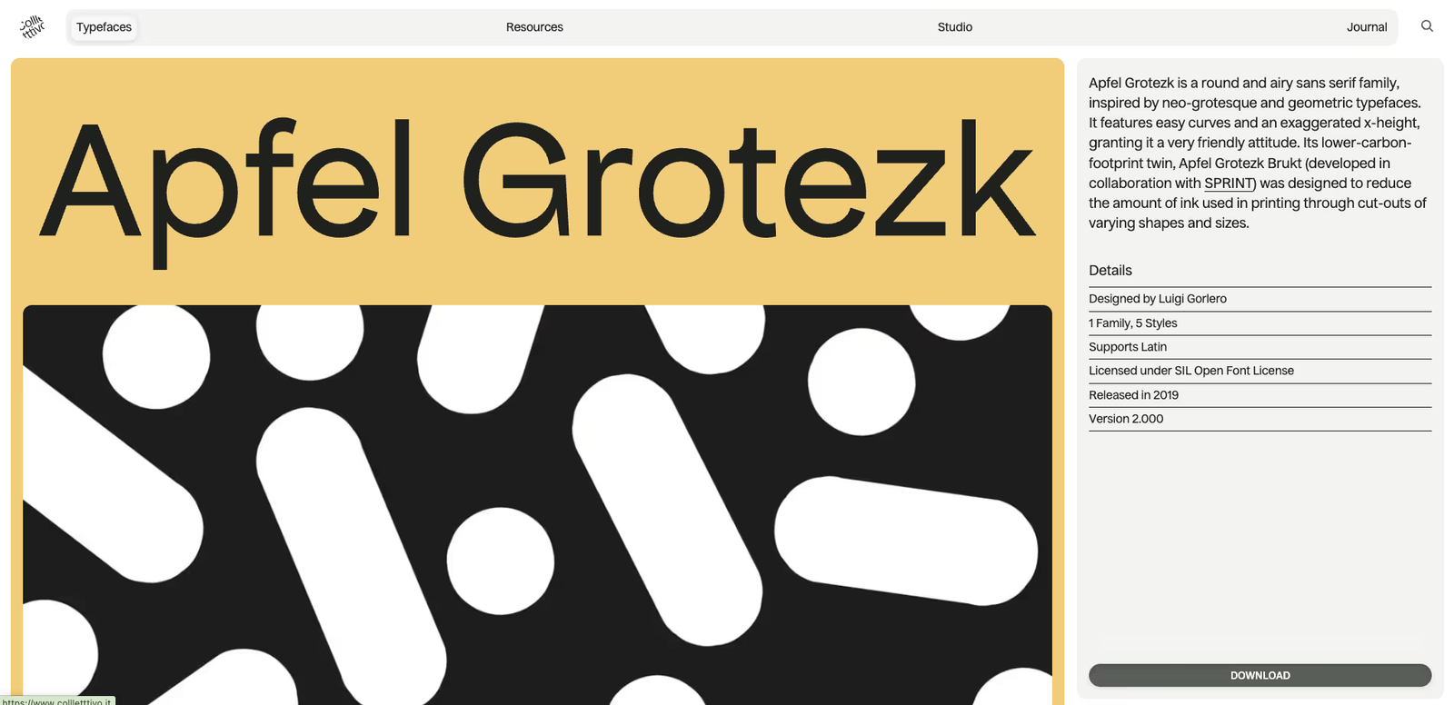
Apfel Grotezk is a round and airy sans serif type family designed by Luigi Gorlero. Inspired by neo-grotesque and geometric typefaces, it combines easy curves with an exaggerated x-height that gives it a very approachable and friendly personality.
What sets Apfel Grotezk apart is not just its design but also its sustainable counterpart, Apfel Grotezk Brukt, created in collaboration with SPRINT. This unique variation uses cut-outs of varying shapes and sizes to reduce ink consumption during printing, making it an environmentally conscious choice for designers.
Details
- Designer: Luigi Gorlero
- Family: 1 Family, 5 Styles
- Supports: Latin script
- License: SIL Open Font License
- Release Date: November 19, 2019
- Last Updated: October 6, 2023
- Version: 2.000
Features & Use Cases
- Friendly curves with exaggerated x-height for legibility
- Works well in both digital and print projects
- Sustainable twin version (Brukt) for eco-friendly printing
- Great for branding, editorial, posters, packaging, and user interfaces
Conclusion
Apfel Grotezk blends warmth, modern simplicity, and sustainability in one type family. Whether you’re designing a bold headline, a user-friendly interface, or want to embrace eco-friendly print design, Apfel Grotezk and its Brukt variation give you both style and responsibility.