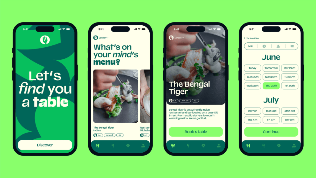
TheFork, Europe and Australia’s leading restaurant booking platform, partnered with DesignStudio to redefine its brand identity. Centered around the idea that “the best things in life happen around the table,” the new identity features a dynamic symbol, vibrant food-inspired colors, and a playful tone of voice. The design reflects TheFork’s mission to unite diners and restaurants through shared experiences.
Uniting Diners and Restaurants
TheFork’s rebrand reflects its mission to bring people together around the table. The dynamic symbol and vibrant colors capture the energy of shared dining experiences, creating a cohesive identity for diners, restaurateurs, and employees.
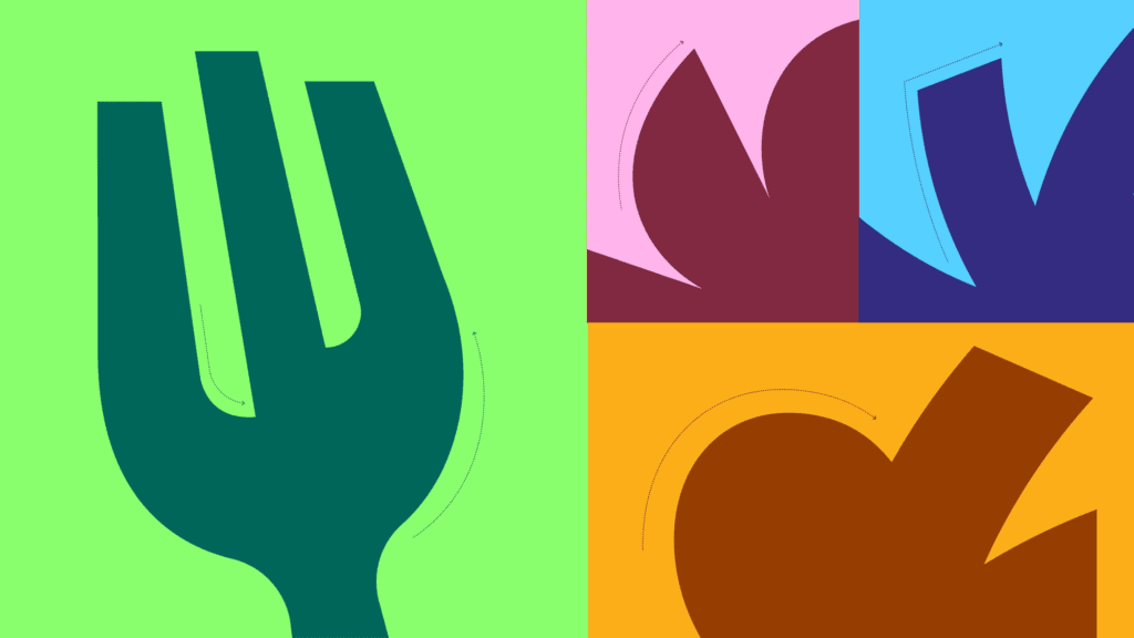
A Symbol of Shared Energy
TheFork’s logo symbolizes the radiating energy of people dining together. This logo design inspires the entire visual system, from typography to illustration, creating a brand full of personality and warmth.
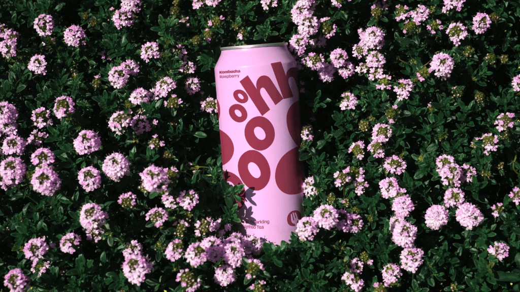
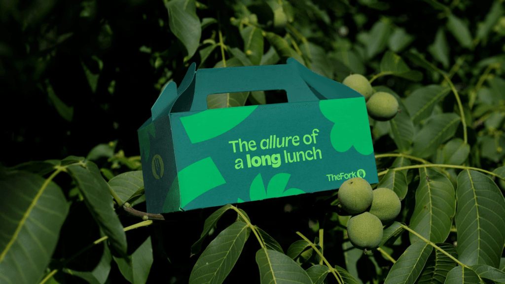
Vibrant Colors Inspired by Food
The color palette combines reinvigorated greens with rich, food-inspired hues. This graphic design approach adds impact and variety, reflecting the diversity of global dining experiences.
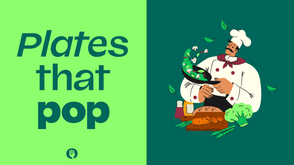
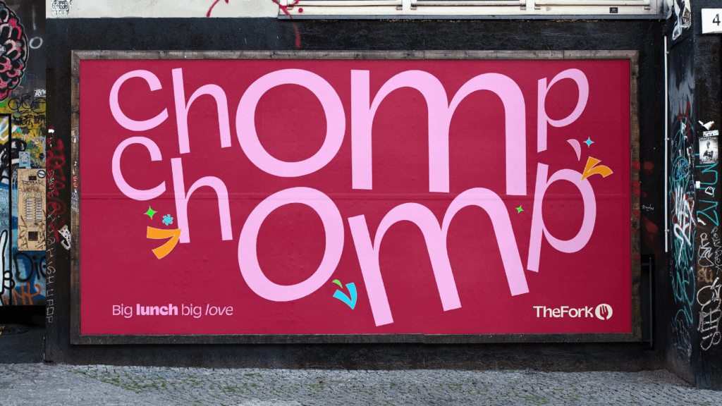
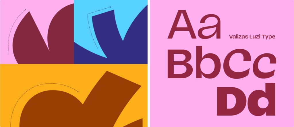
A Playful and Welcoming Tone of Voice
TheFork’s tone of voice is punchy yet playful, designed to evoke passion and connection. This typography and language system empowers employees to engage with diners and restaurateurs in a distinctive way.
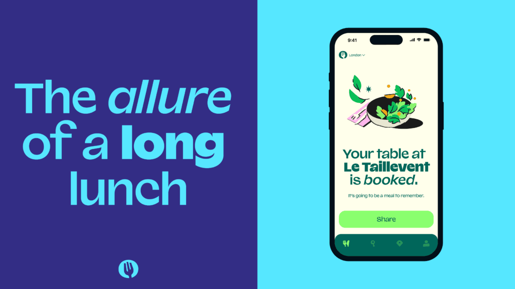
From Digital to Physical: A Unified Brand Experience
The identity extends across digital platforms, packaging, and in-app experiences. The UI/UX design ensures a seamless and engaging experience for users, reinforcing TheFork’s position as a leader in restaurant bookings.