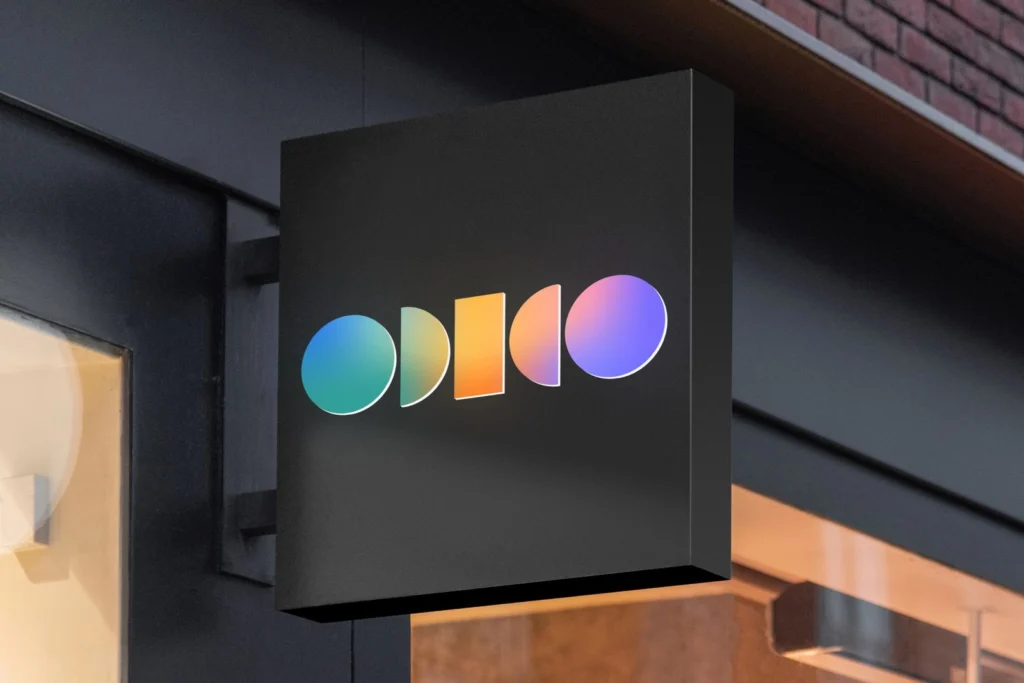
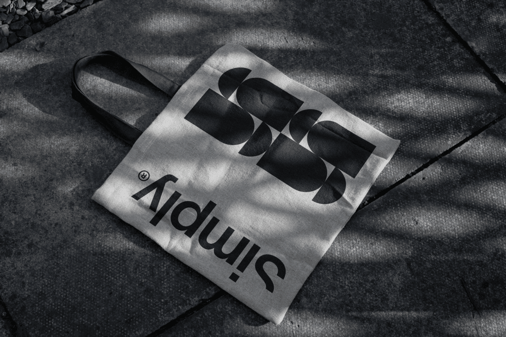
Simply, a Belgian communication agency, partnered with Victor Berriel to create a minimalist yet bold visual identity. The design features vibrant colors, prism-like light rays, and a distinctive cut in the brand’s initial “S,” symbolizing creativity and defiance. The identity reflects Simply’s commitment to simplicity, innovation, and Belgian design traditions, positioning it as a leader in the global design stage.
A Minimalist Identity with Bold Touches
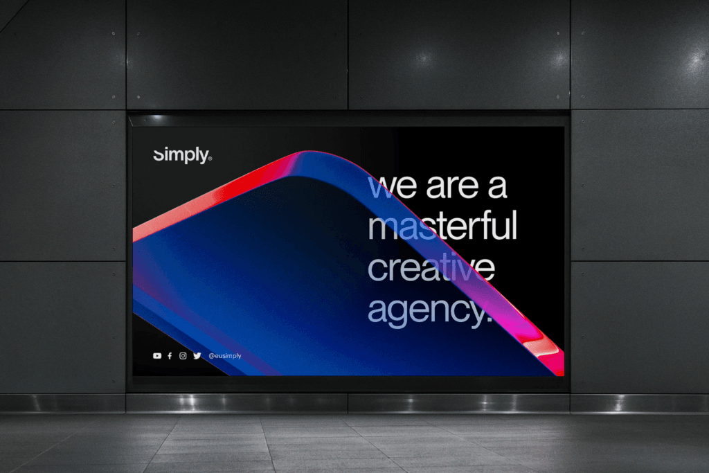
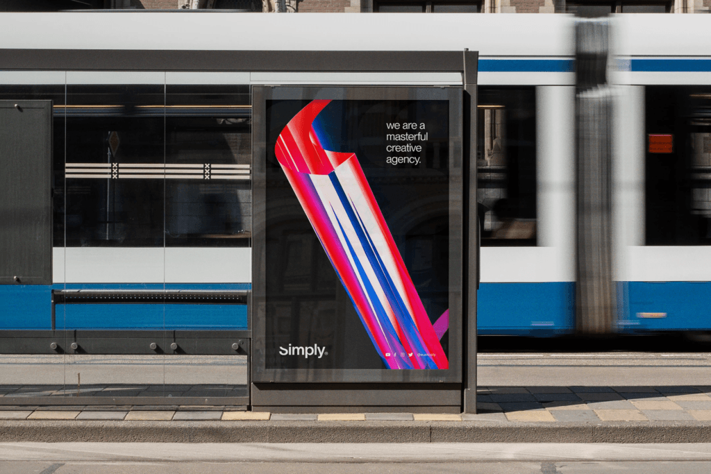
Simply’s visual identity features vibrant colors and prism-like light rays, creating a modern and dynamic look. The bold cut in the “S” adds a touch of defiance, reflecting the brand’s creative and innovative spirit.
Reflecting Belgian Design Traditions
The minimalist design aligns with Belgian traditions in design and architecture, ensuring Simply stands out on the global stage. This graphic design approach balances simplicity with personality.
A Name That Embodies Simplicity
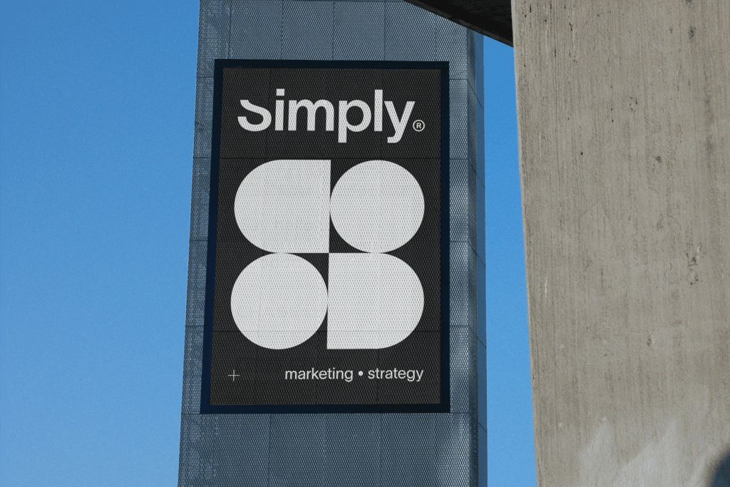
The name “Simply” reflects the agency’s ethos of straightforward and uncomplicated solutions. The typography and design elements reinforce this commitment to minimalism and clarity.
A Cohesive Visual System
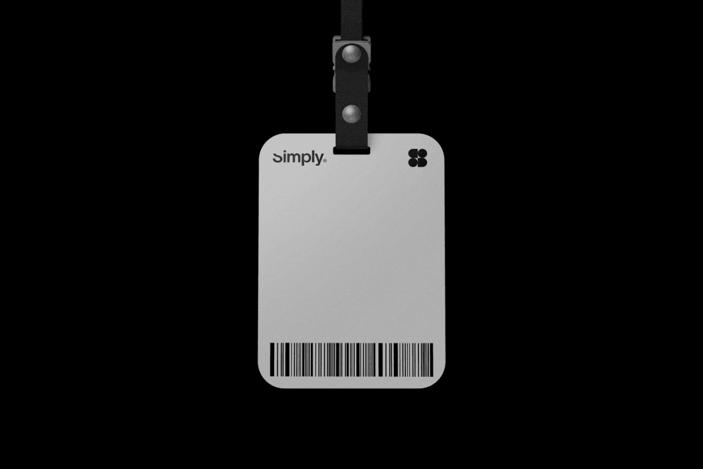
The identity extends across all communication aspects, ensuring a consistent and powerful brand presence. The logo design and illustration system create a unified experience for clients and audiences.
Positioning Simply as a Global Leader
The rebrand positions Simply as a leader in the communication industry, blending creativity, innovation, and simplicity. The UI/UX design ensures the brand resonates with a global audience.