


Urban District Branding at the Crossroads of Culture
Regent’s Place sits at the intersection of Camden, the Knowledge Quarter, and the West End—a nexus of creativity, science, and commerce. The logo design (symbolic ‘R’) visually unites these districts, while environmental graphics on signage and hoardings reflect their unique cultural identities.


Sustainable Material Choices for Eco-Conscious Branding
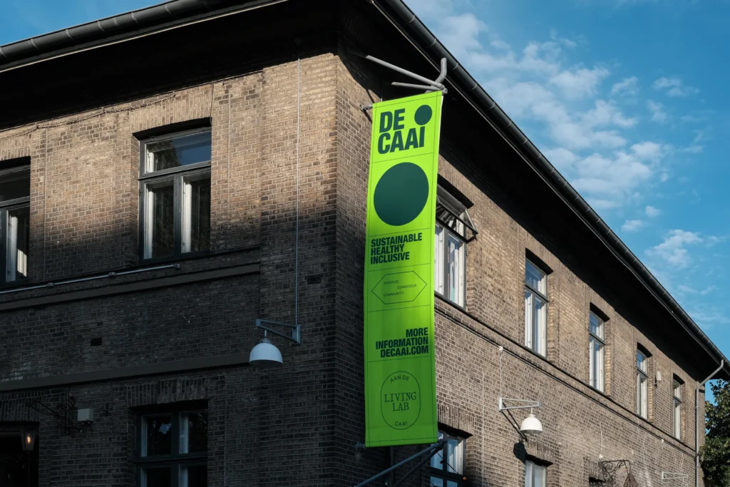
From recycled hoardings to low-impact inks, every design decision prioritizes planetary health. Graphic design embraces natural textures and organic shapes, aligning aesthetics with Regent’s Place’s mission to “re-use, reduce, recycle” without compromising visual impact.

Transparent Brand Identity Reflecting Urban Evolution
The nearly invisible ‘R’ logo symbolizes Regent’s Place’s ethos: a space that empowers people and ideas to take center stage. Environmental graphics and minimalist logo design create a flexible system adaptable to future urban shifts.

Designing for Community Engagement and Inclusivity
The ‘R’ emblem acts as a transparent frame for local stories, turning branding into a collaborative canvas. Typography choices (clean yet warm) and participatory workshops ensure the identity evolves with input from residents, businesses, and environmental advocates.

Balancing Aesthetics and Ecology in Urban Spaces
“Radical softness” merges calming organic lines with bold sustainability messaging. Graphic design integrates biophilic patterns and muted earth tones, transforming physical spaces into serene, planet-first environments.