Komero, a Finnish ready-meal startup, partnered with Werklig to redefine its brand identity. Centered around the concept of being the “only meal accelerator in the world,” the rebrand features a bold, cupboard-inspired logo, vibrant packaging, and a mission to save time, the environment, and hearts. The design reflects Komero’s commitment to healthy, planet-friendly meals for everyday achievers.

A Bold Identity for Healthy Meals
Komero’s rebrand positions it as the “only meal accelerator in the world,” offering healthy, ready-to-eat meals. The bold, cupboard-inspired logo and vibrant packaging design reflect its mission to save time and the planet.
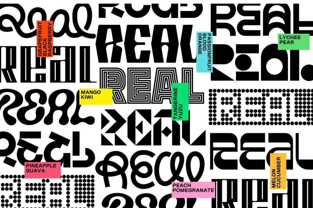
Cupboard-Inspired Logo for a Unique Brand
The logo, with letters crammed into a “cupboard,” symbolizes Komero’s love for food and innovation. This logo design is big and bold, making it stand out on supermarket shelves.
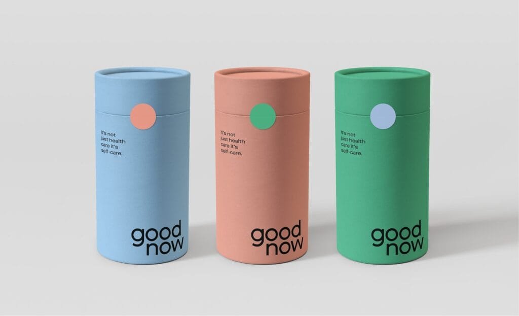
Vibrant Packaging for Everyday Achievers
The packaging design uses vibrant colors and playful visuals to appeal to busy, health-conscious consumers. This graphic design approach ensures Komero stands out in a crowded market.
A Mission to Save Time and the Planet
Komero’s identity reflects its commitment to healthy, planet-friendly meals. The typography and illustration system reinforces its values of progress and care for others.
Award-Winning Design for a Growing Brand
The rebrand earned a Gold award at Vuoden Huiput 2022, recognizing its innovative approach to packaging design and brand storytelling.