Jiffy, a London-based ultrafast grocery delivery service, partnered with Shuka to create a brand identity that goes beyond speed. The design features a robin-inspired logo, symbolizing care and protection, alongside simple shapes and a robin-red color palette. The identity balances vibrant urban touchpoints with muted tones for existing customers, reflecting Jiffy’s dual focus on speed and care.

A Robin-Inspired Logo for Care and Speed
Jiffy’s logo, inspired by the beloved British robin, symbolizes care and protection. The crescent-shaped wings reflect the brand’s mission to deliver groceries with both speed and care.
Simple Shapes for a Clean Visual Language
The identity uses simple shapes and clean lines, creating a modern and approachable aesthetic. This graphic design approach ensures the brand stands out in the competitive delivery market.
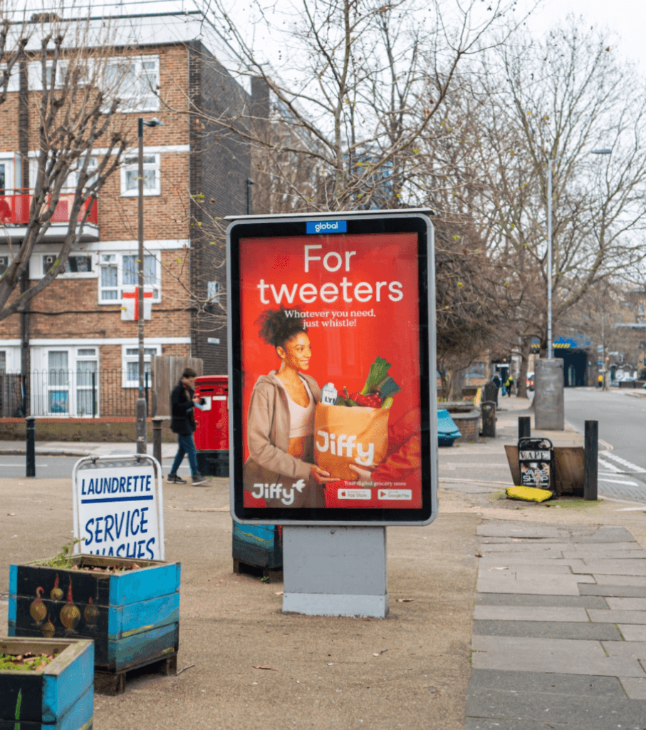
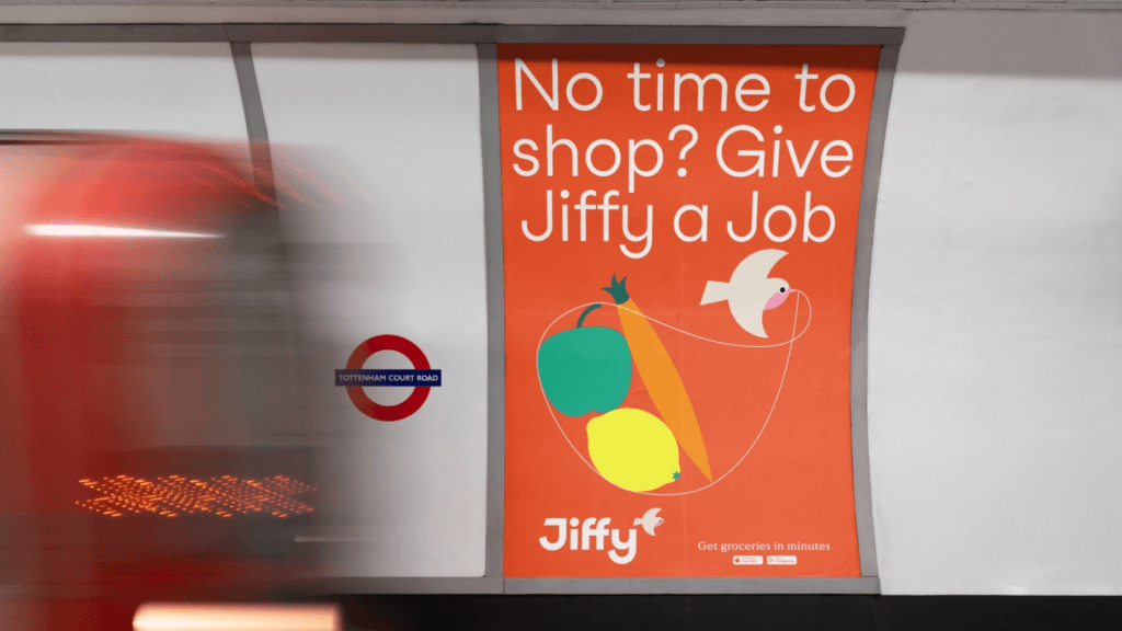
Robin Red for Vibrant Urban Touchpoints
The robin-red color palette is used to attract potential customers at urban touchpoints, while muted tones are reserved for existing users. This typography and color strategy reinforces Jiffy’s dual focus on acquisition and retention.
Balancing Speed and Care in Design
The identity reflects Jiffy’s commitment to both speed and care. The illustration and design system ensure the brand resonates with Londoners who value convenience and reliability.
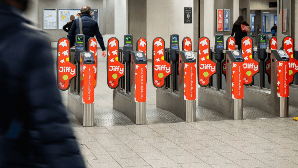
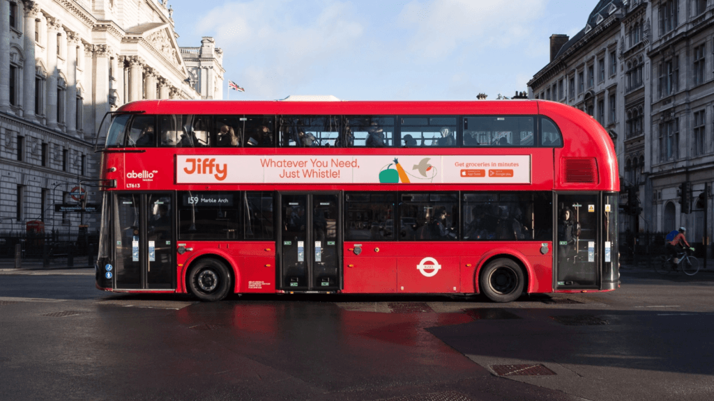
A Cohesive Identity Across Platforms
From urban touchpoints to digital platforms, the identity maintains consistency across all touchpoints. The UI/UX design ensures a seamless and engaging experience for users.