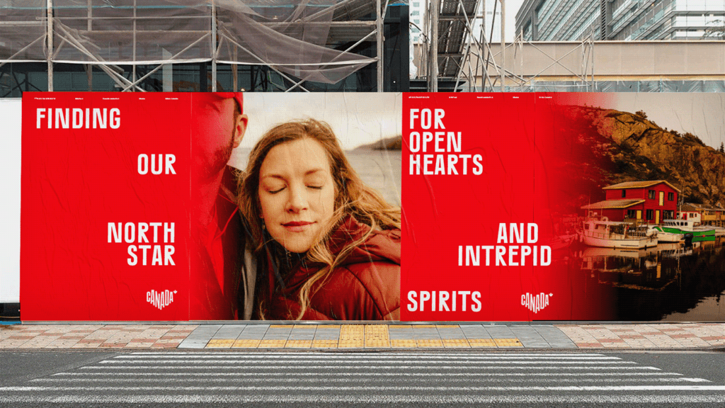
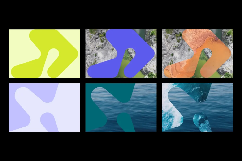
Generative Design for Scientific Connection
A custom Dubins Path algorithm creates infinite icons and logos, symbolizing the Council’s mission to connect researchers, funding, and institutions. Developed with mathematicians and developers, this interaction design tool reflects the shortest path to innovation.

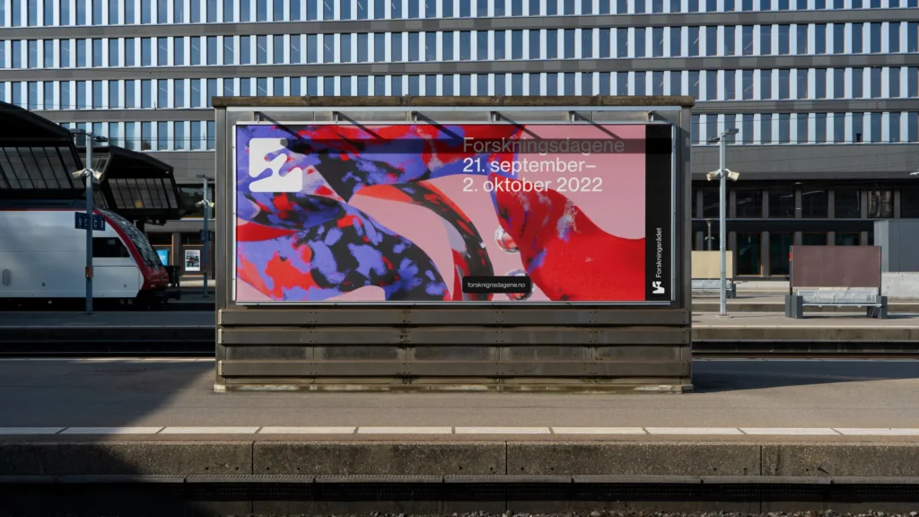
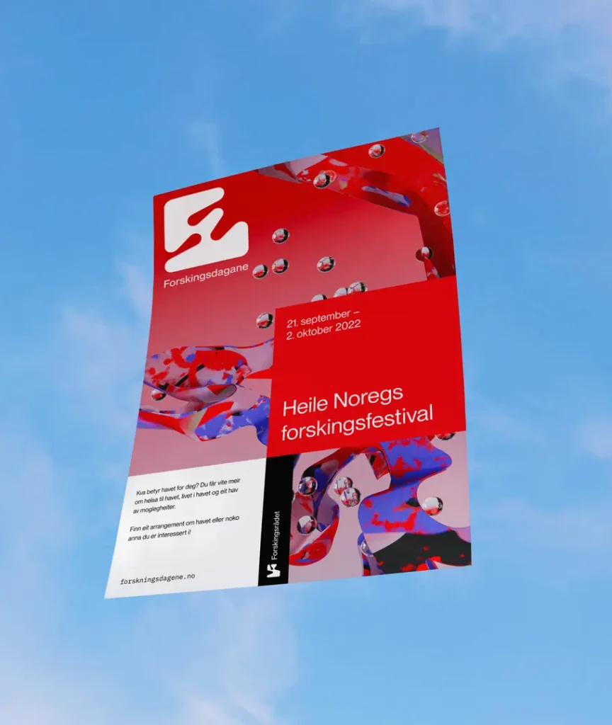
3D Universes Unifying Complex Systems
Collaborative 3D graphics (@CATKBerlin) bind diverse sub-brands into a cohesive visual language. From digital templates to physical plaques, the 3D art system scales across 100+ assets, ensuring consistency in reports, flags, and digital interfaces.


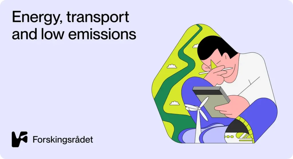
Sustainability Meets Scientific Prestige
Awards crafted from 100% recycled plastic waste (yogurt cups, e-waste) redefine recognition. These eco-conscious branding pieces align with Norway’s environmental values while celebrating research excellence.
Educating Future Innovators
“Dubins’ Zoo” illustrations simplify complex science for young audiences. Playful 3D animals and globes (illustration) engage students, fostering curiosity through the Council’s Nysgjerrigper program.

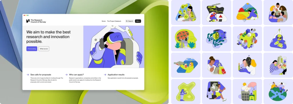
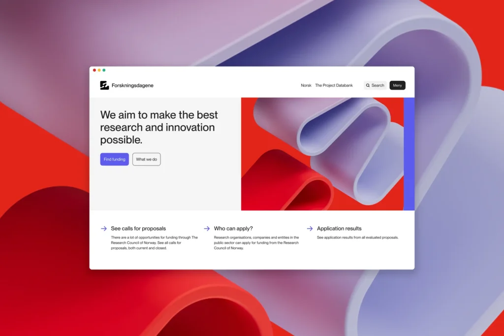
A Design System for 38 Sub-Brands
Modular templates (posters, screensavers, Instagram stories) empower seamless communication. Graphic design principles ensure flexibility for niche programs like Forskningsdagene (Research Festival) without diluting the core identity.