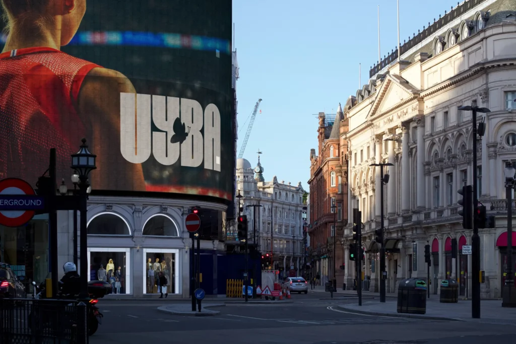
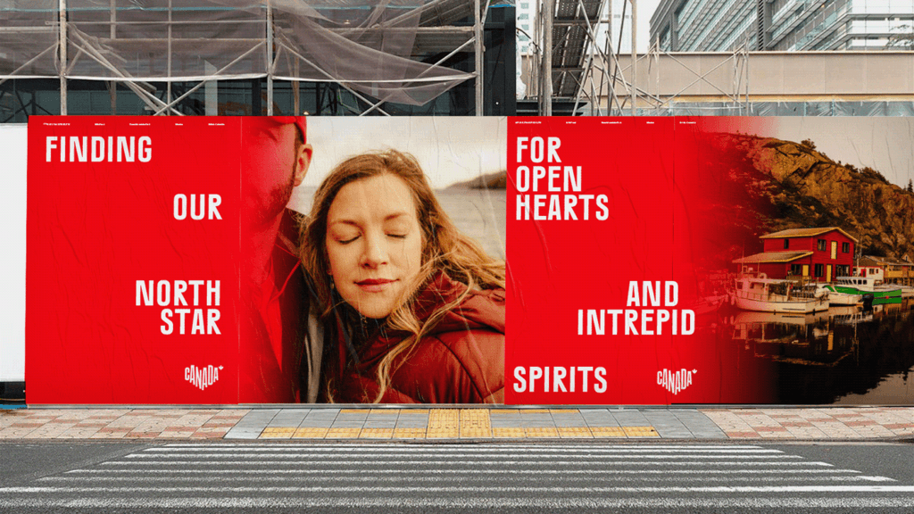
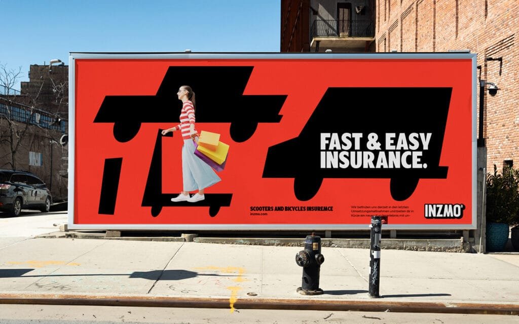
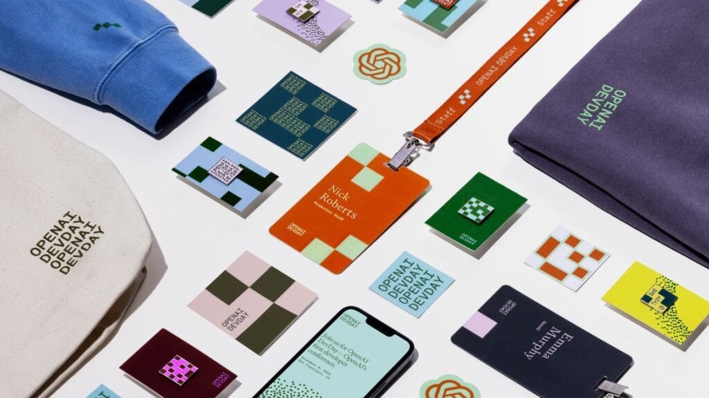
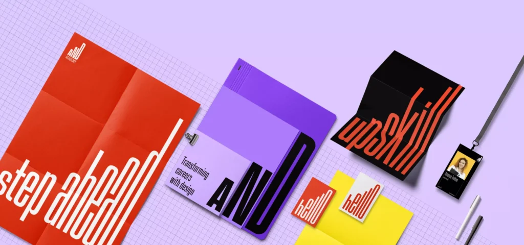
This branding project brings together design precision and strategic insights to craft a distinct identity. From the logo and typography to color schemes and packaging, each component is designed for consistency and memorability. The approach prioritizes both aesthetics and function, ensuring the brand communicates effectively across digital and physical touchpoints. Research-driven insights shape the visual direction, aligning with the brand’s values and audience expectations to create a strong market presence.

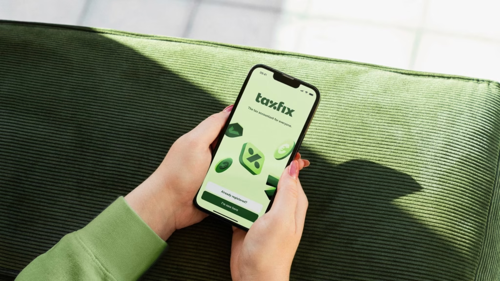
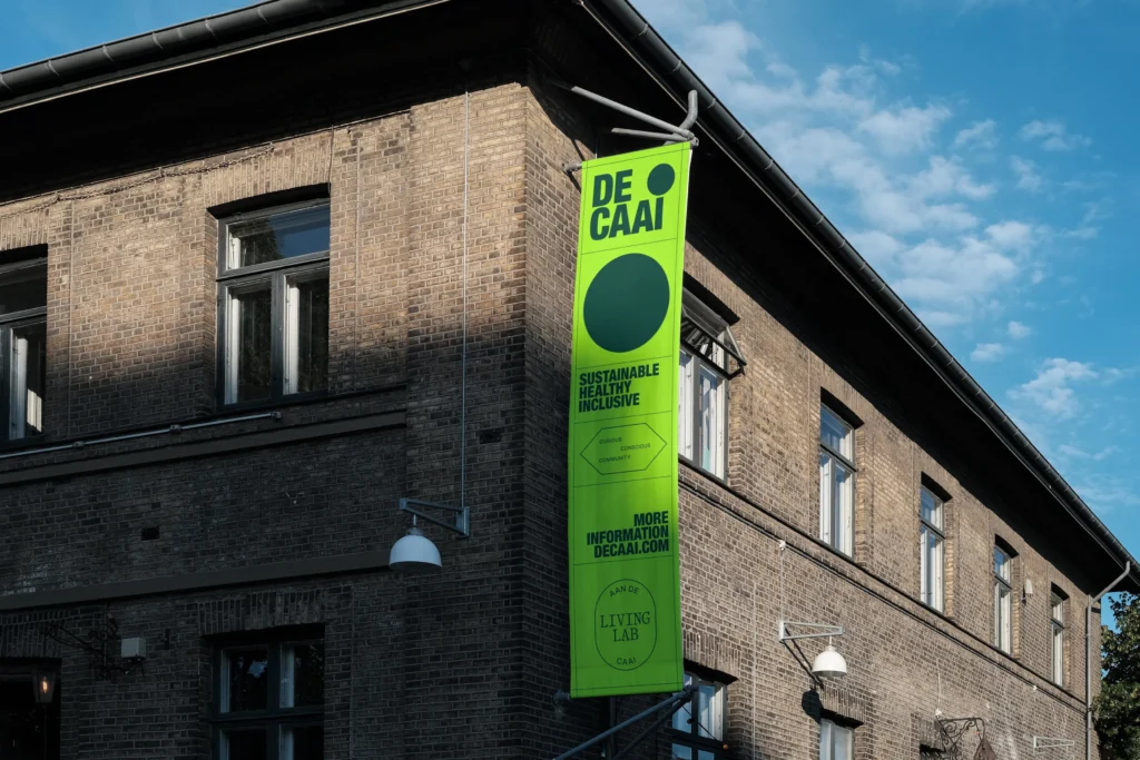
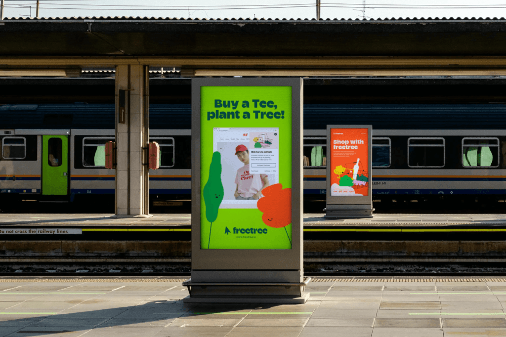
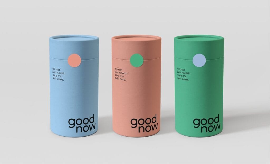
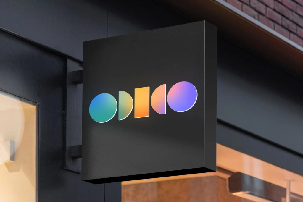
The logo is versatile and instantly recognizable, serving as the brand’s visual cornerstone. A carefully curated color palette and typography enhance brand recall, while the packaging and marketing materials ensure consistency across platforms. Every design decision is intentional, supporting the overall brand narrative and user experience.
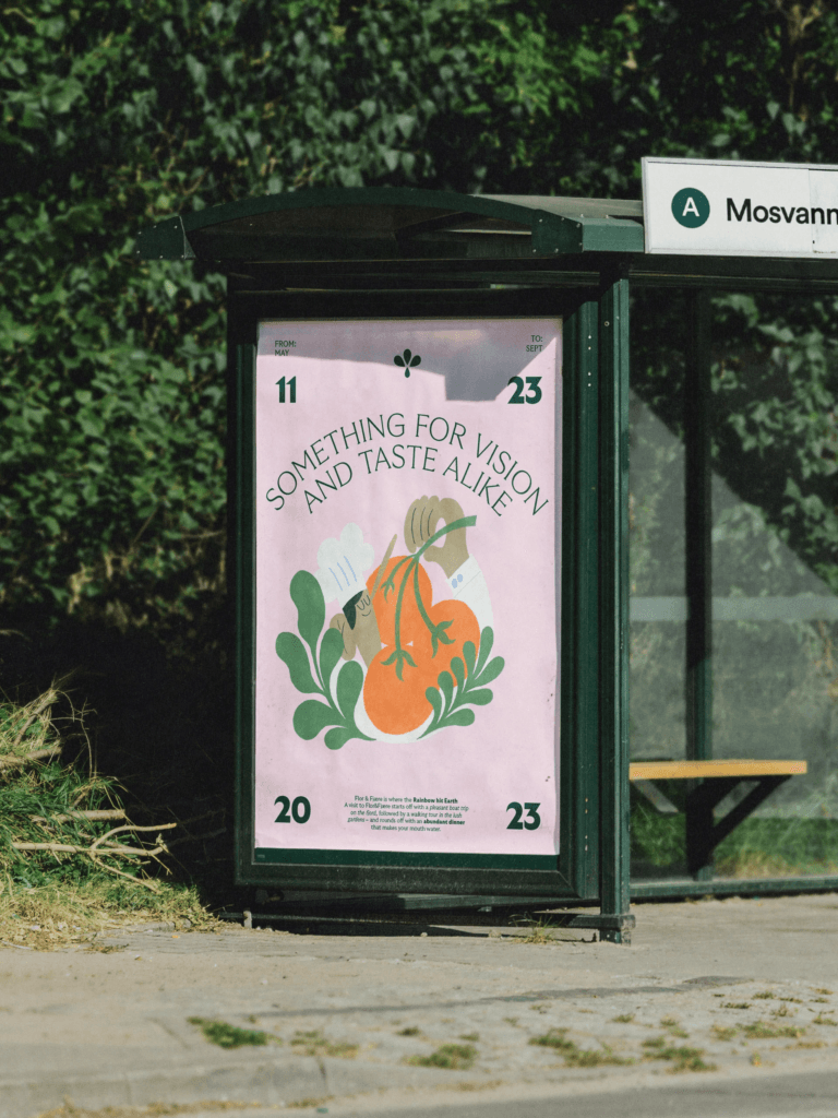

Illustration and Typography that Tell a Story
To enhance the visual identity, Finnish illustrator Robert Lönnqvist was brought in to develop a set of brand illustrations that depict the essence of Flor & Fjære. The chosen typography, GT Ultra, complements the intricate details of the island’s landscape, creating a seamless connection between design and nature.


Strong branding goes beyond design—it tells a story and builds a connection. This project illustrates how cohesive visuals and strategic decisions shape an impactful brand identity.