Destination Canada’s rebrand, For Open Hearts, introduces a human-centric identity to inspire global travelers to visit Canada. The design features a universal heart-shaped logo, bold typography inspired by Canadian roots, and a vibrant red and wood-toned color palette. The identity extends across photography, typography, and graphic platforms, capturing the diversity and warmth of the country.
A Heart-Shaped Logo for Universal Appeal
The heart-shaped logo symbolizes Canada’s warmth and hospitality, leaving a lasting impression on travelers. This logo design reflects the country’s open-hearted identity and universal appeal.
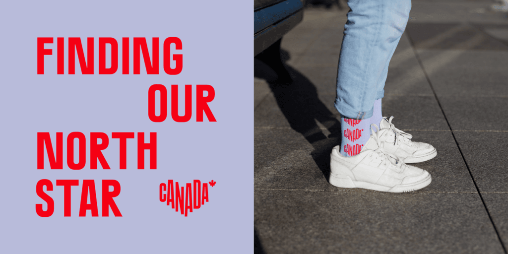
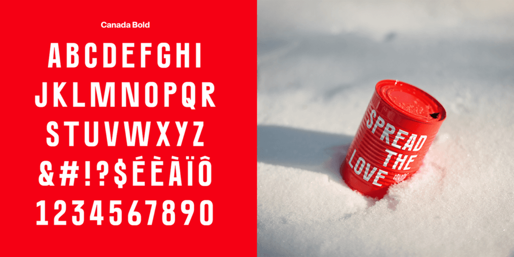
Bold Typography Inspired by Canadian Roots
The custom typography, inspired by Canada’s rugged landscapes, is solid, bold, and intentionally imperfect. This typography choice reinforces the country’s authenticity and strength.
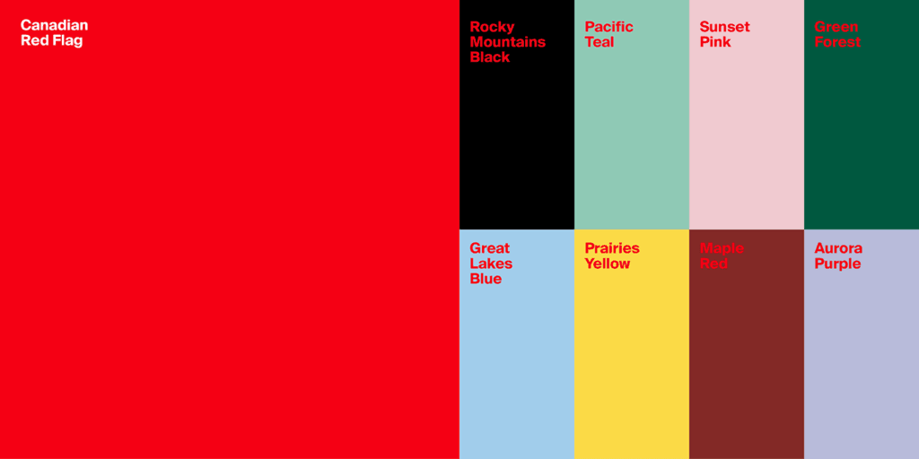
A Vibrant Red and Wood-Toned Palette
The color palette combines vibrant red and natural wood tones, reflecting Canada’s iconic maple leaf and diverse landscapes. This graphic design approach ensures the brand stands out globally.
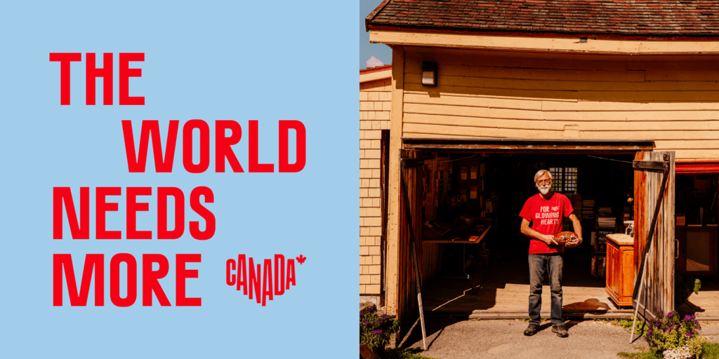
Photography That Captures Diversity
The identity includes a vast collection of photographs taken across Canada, capturing moments, connections, and stories. This photography strategy showcases the country’s diversity and invites travelers to explore.
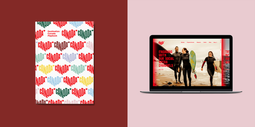
A Cohesive Identity Across Platforms
From print materials to digital platforms, the identity maintains consistency across all touchpoints. The illustration and design system ensure a unified and engaging experience for travelers.