
Time – A Rebrand by For The People
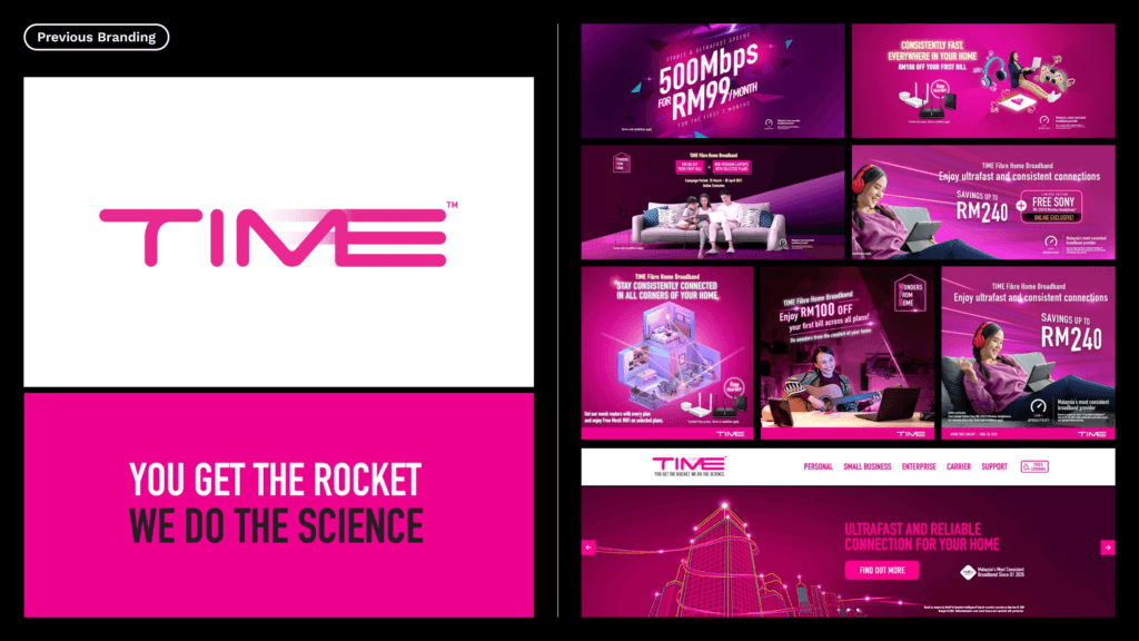
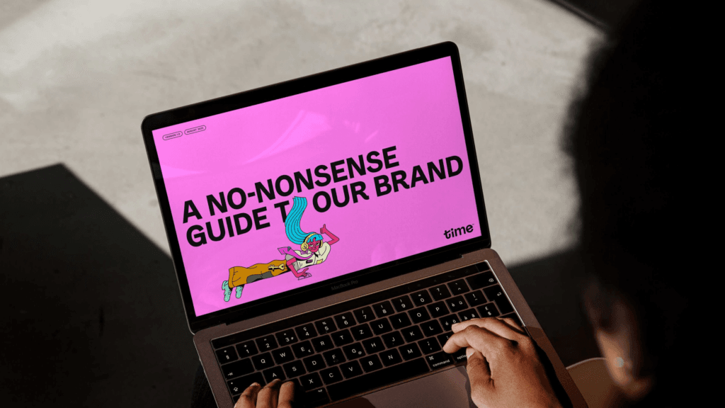
For The People redefined the brand identity of Time, Malaysia’s challenger internet service provider, with a bold, future-ready rebrand that captures the authentic spirit of online lives.
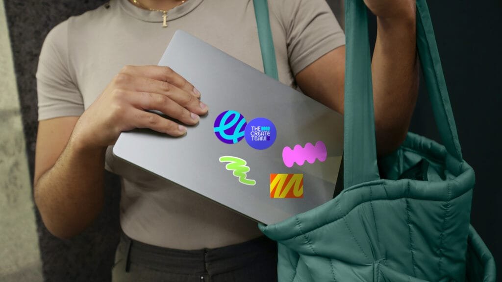
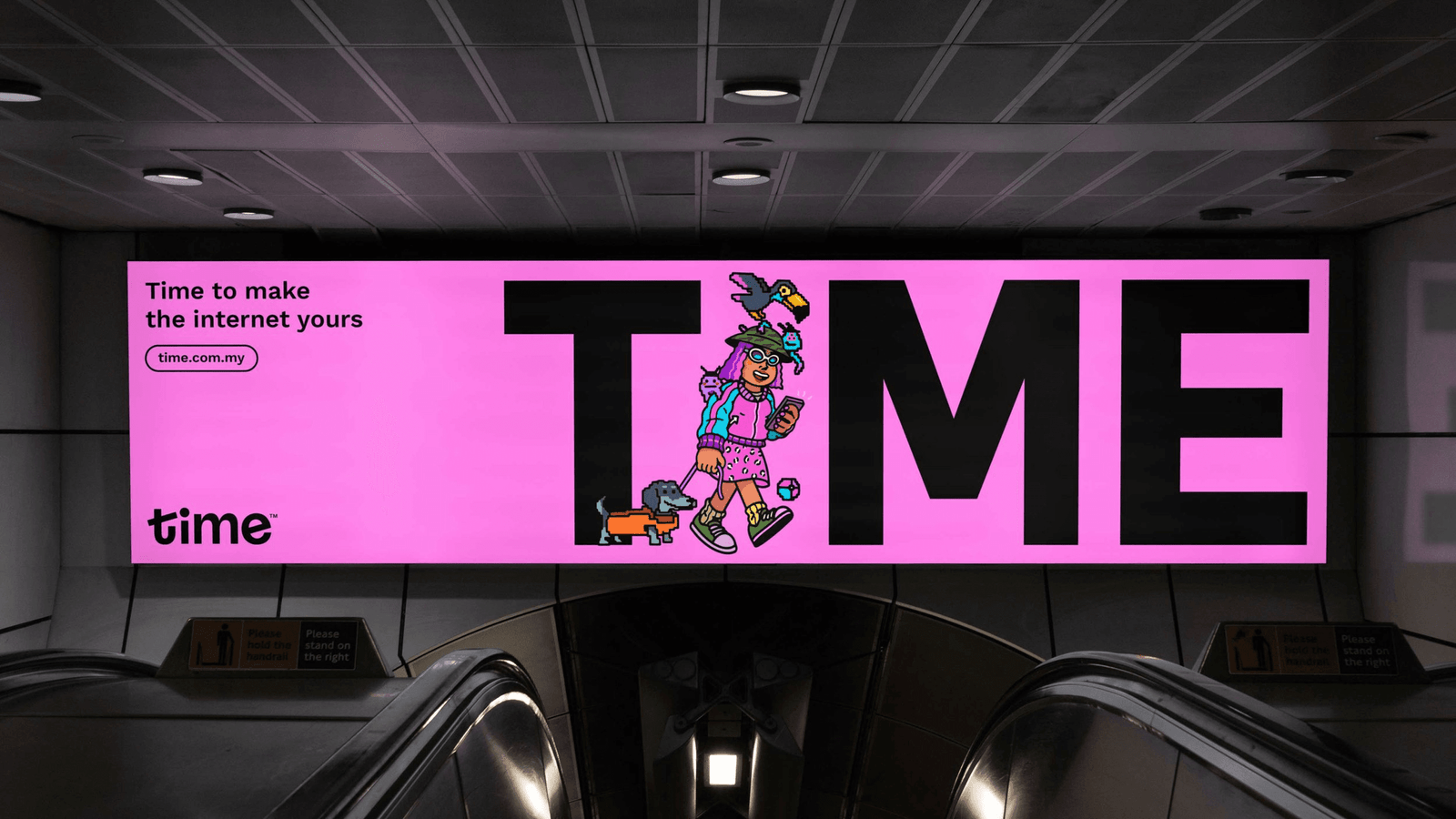
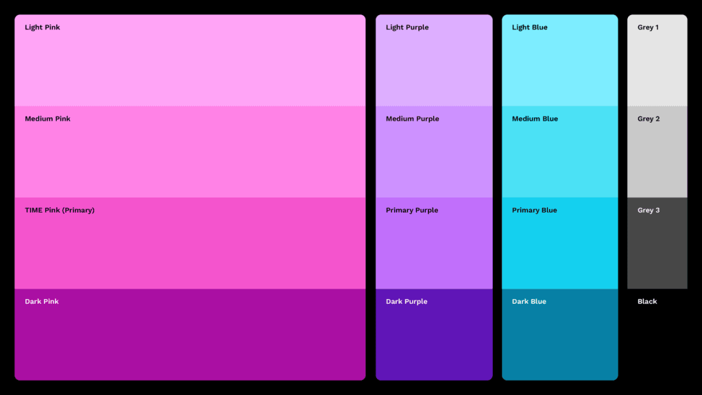
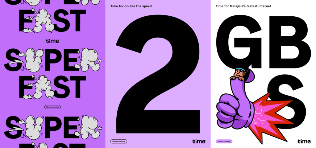
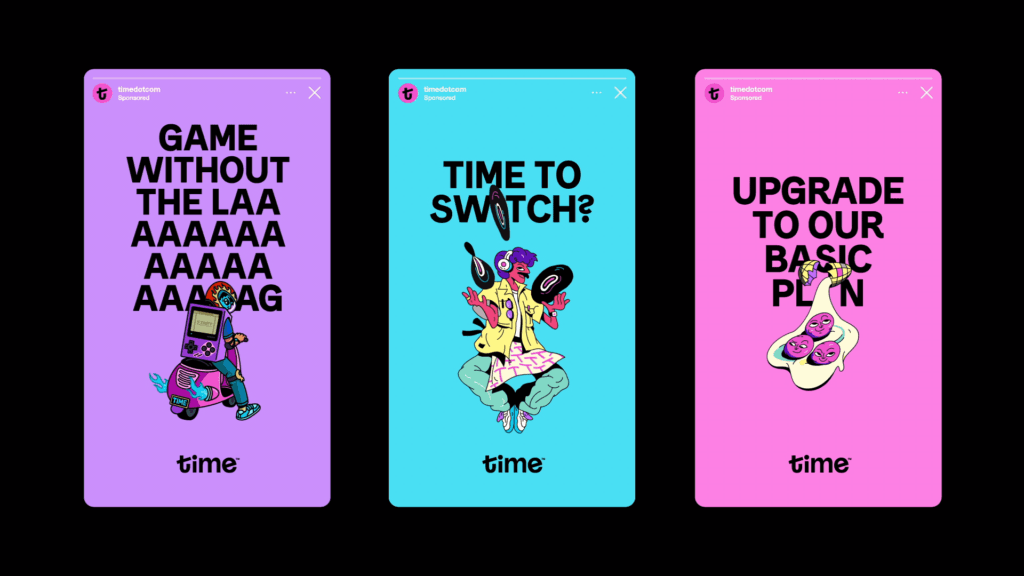
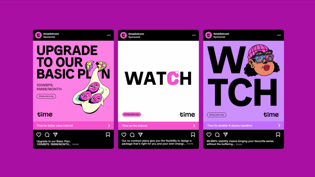
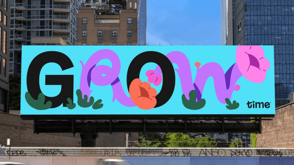
The new visual identity moves away from cluttered industry aesthetics, focusing instead on clarity, radical honesty, and cultural specificity. Anchored by Time’s signature pink, the refreshed design introduces refined color gradients, expressive typography, and locally inspired illustrations.
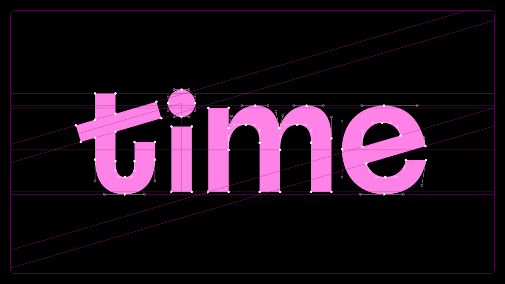
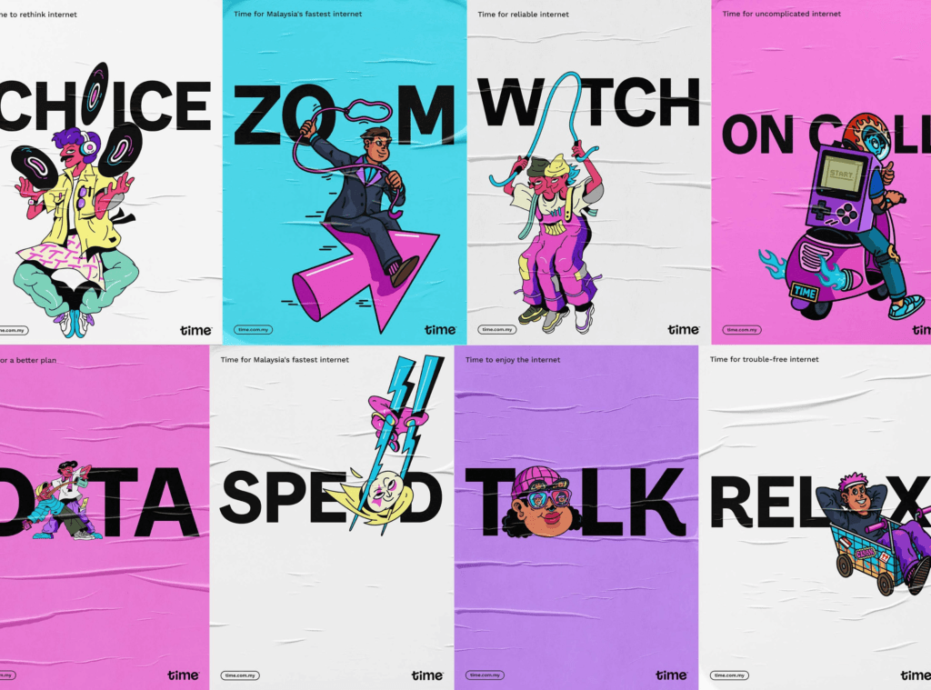
A central feature of the rebrand is the custom Sans of Time typeface, developed in collaboration with typographer Mathieu Régeur. With expressive alternates—LIVE, WORK, and PLAY—the type system reflects the diverse ways Malaysians connect online, blending seamlessly into the brand’s flexible communication style.
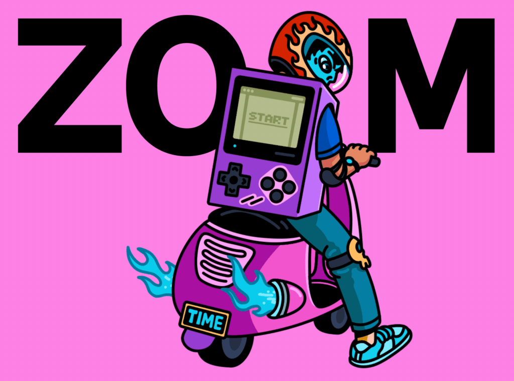
Illustrations by artists Cloakwork and Shu Yee bring local character into the brand system, ensuring authenticity and cultural resonance. Combined with a witty, straightforward brand voice, the rebrand positions Time as both approachable and trustworthy in a highly competitive market.
The results speak for themselves: higher market valuation, record growth, and recognition across major design awards including D&AD, AGDA, Best Awards, and Transform Awards.
This rebrand demonstrates how branding, brand identity, and creative strategy can transform a telecom brand into a cultural force—balancing business goals with a human-centered design approach.
Credits: For The People
