

Introduction: Kaffeeform Branding & Sustainable Design
Kaffeeform branding sustainable design is an inspiring example of how creativity and ecology merge. Designed by Studio Bruch, the brand identity captures the philosophy of giving coffee waste a second life. Instead of ending up as trash, renewable resources are reshaped into eco-friendly, long-lasting products.
The Concept of Reuse and Reshape
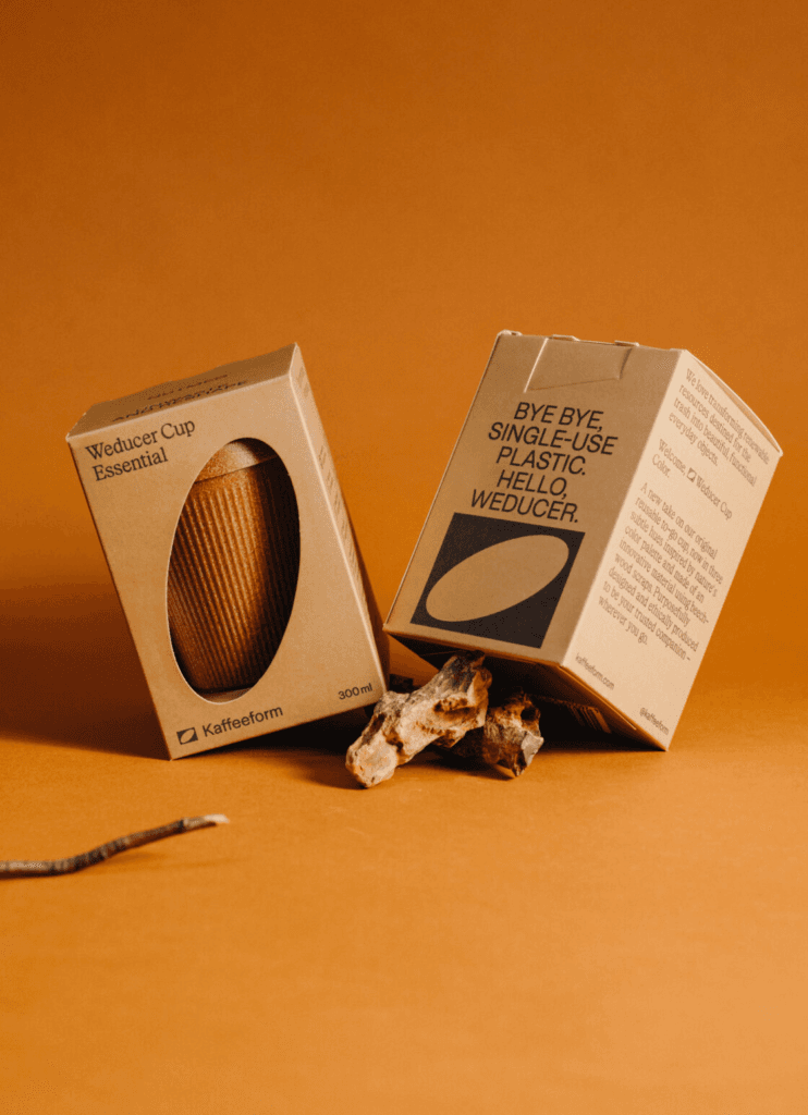
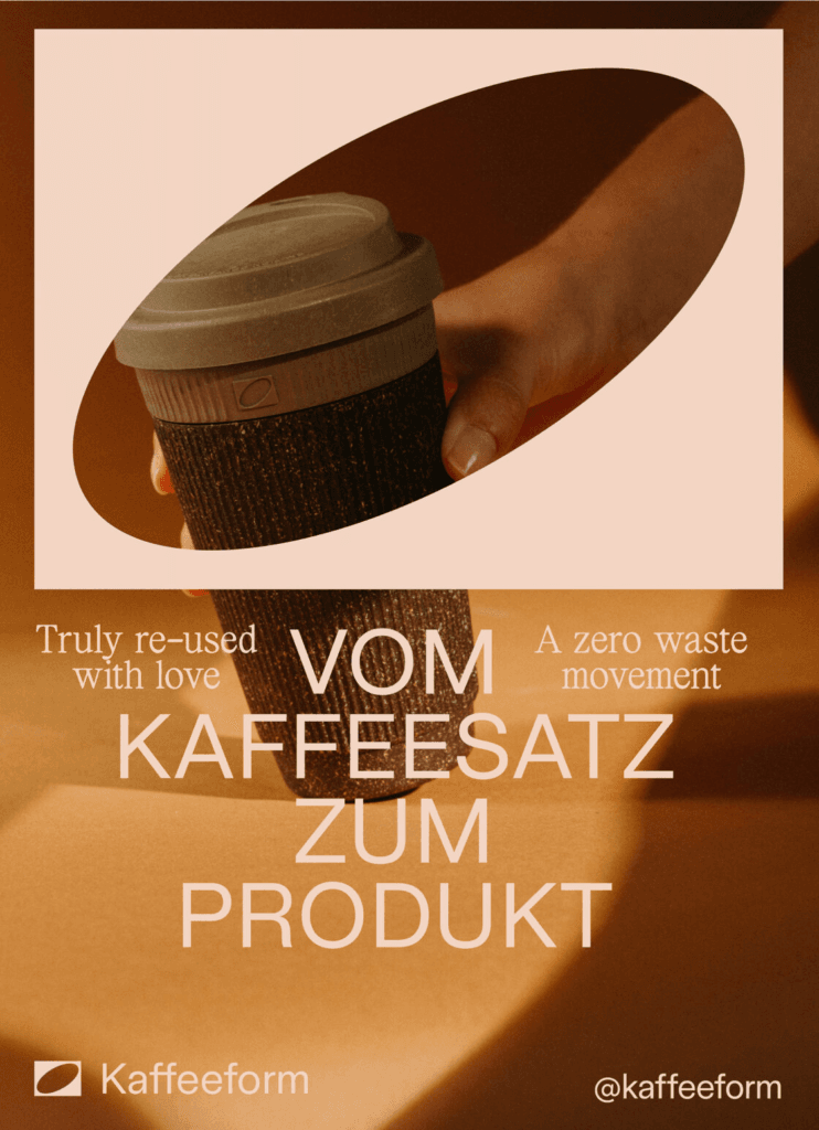
At the heart of Kaffeeform branding is the concept of circular design. The reversed oval logo symbolizes a coffee bean that has been reimagined into something new and purposeful. This visual metaphor communicates transformation and innovation — values deeply rooted in Kaffeeform’s mission.
Visual Identity and Aesthetic Choices
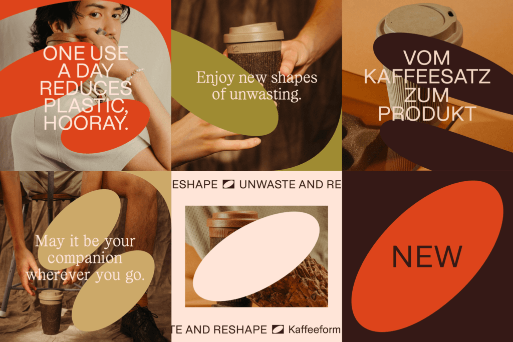
The design approach relies on earthy tones, organic shapes, and clean, modern typography. This balance reflects both tradition and progress, ensuring the brand stands out in the sustainable design landscape. Studio Bruch successfully crafted an identity that feels natural yet modern, aligning with Kaffeeform’s eco-conscious values.
Packaging Design with Purpose
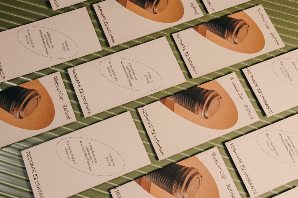
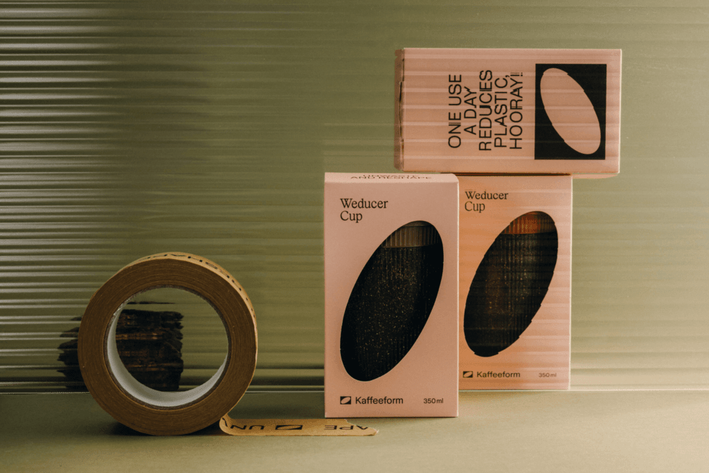
One of the most remarkable aspects of Kaffeeform branding is the packaging design. Beyond aesthetics, the packaging communicates responsibility and sustainability. Every detail — from material choice to visual elements — reinforces the idea that sustainability can be stylish and innovative.
The Role of Photography and Digital Presence
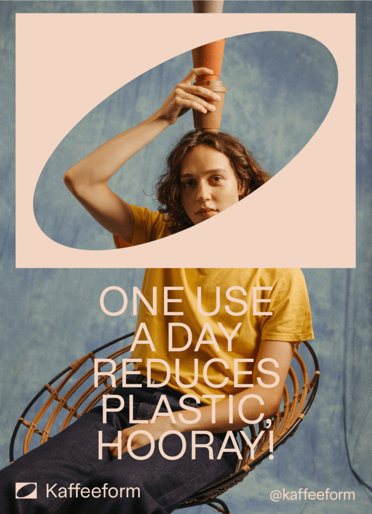
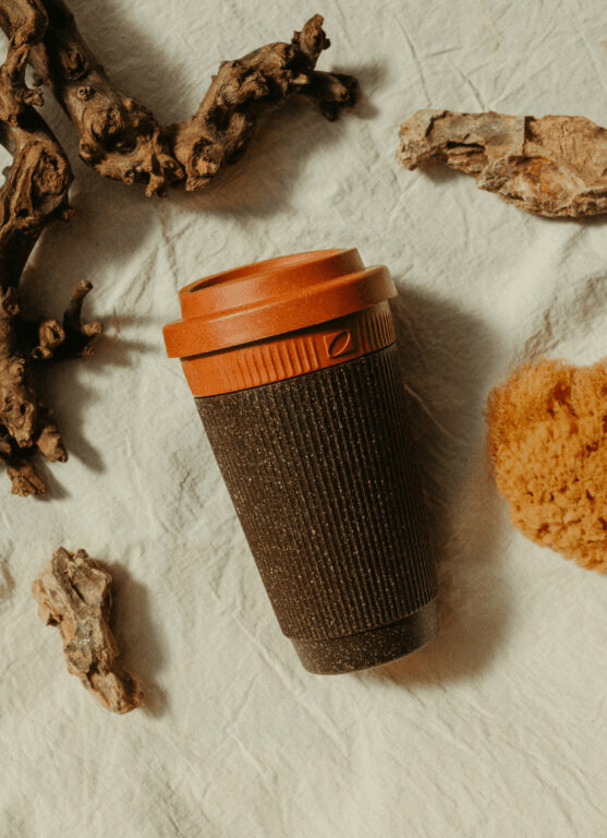
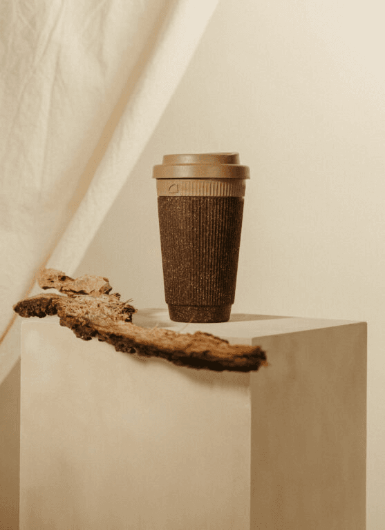
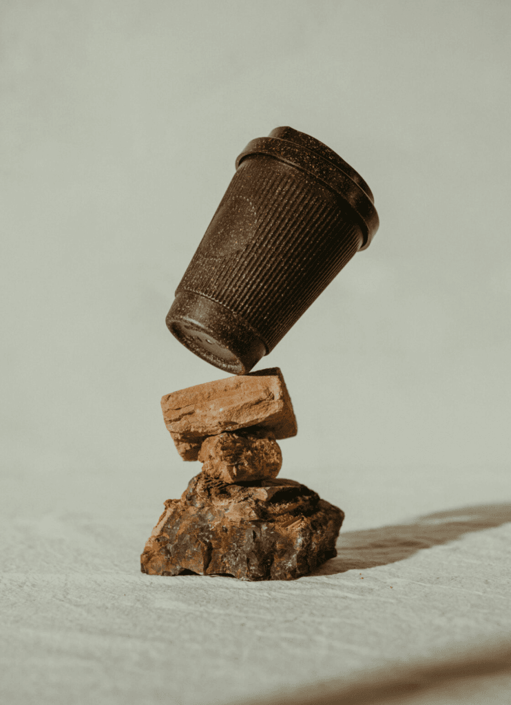
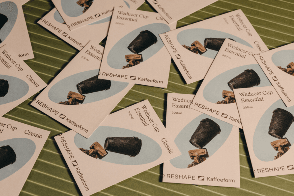
Kaffeeform’s branding extends to digital and print applications. Product photography highlights textures and earthy color palettes, while digital branding ensures consistency across platforms. This flexible system creates a seamless customer experience, from physical packaging to online storytelling.
Why Sustainable Branding Matters
In today’s world, sustainability is no longer optional — it’s essential. Kaffeeform branding demonstrates how design studios like Studio Bruch can turn ecological responsibility into a powerful brand story. By integrating sustainable design principles, brands connect with eco-conscious consumers who seek purpose-driven products.
Conclusion: Kaffeeform’s Place in Circular Innovation
Kaffeeform branding is more than a design project — it’s a movement. By combining innovation, sustainability, and strong visual identity, the brand positions itself as a pioneer in eco-conscious living. This project is proof that design has the power to reshape waste into beauty and inspire positive change.
Credits: Kaffeeform × Studio Bruch
