
Copenhagen-based design agency Studio Morfar has crafted the identity, website, and app for Yoderlay, a soon-to-launch UK app designed to seamlessly connect trusted tradespeople with local customers.
The founders envisioned Yoderlay as a disruptive force in the home services sector, striking a balance between innovation and respect for tradespeople—enhancing their livelihoods instead of undermining them.
While Studio Morfar typically focuses on B2B projects, the team embraced the opportunity to dive into the consumer-facing realm. “There’s often more at stake, but it allows us to approach the project with deeper, more comprehensive research,” explains Torsten Power, founder and creative director of Studio Morfar.
Building Trust: The Heart of Yoderlay

Reliability became the cornerstone of Yoderlay’s brand, aiming to instill confidence in both tradespeople and customers.
“Yoderlay is designed to help customers find trusted tradespeople in urgent situations while offering tradespeople a reliable platform to manage their livelihood,” says Power. “Establishing trust on both sides was essential from day one.”
Studio Morfar’s research highlighted a gap in the market: existing platforms failed to connect meaningfully with both user groups.
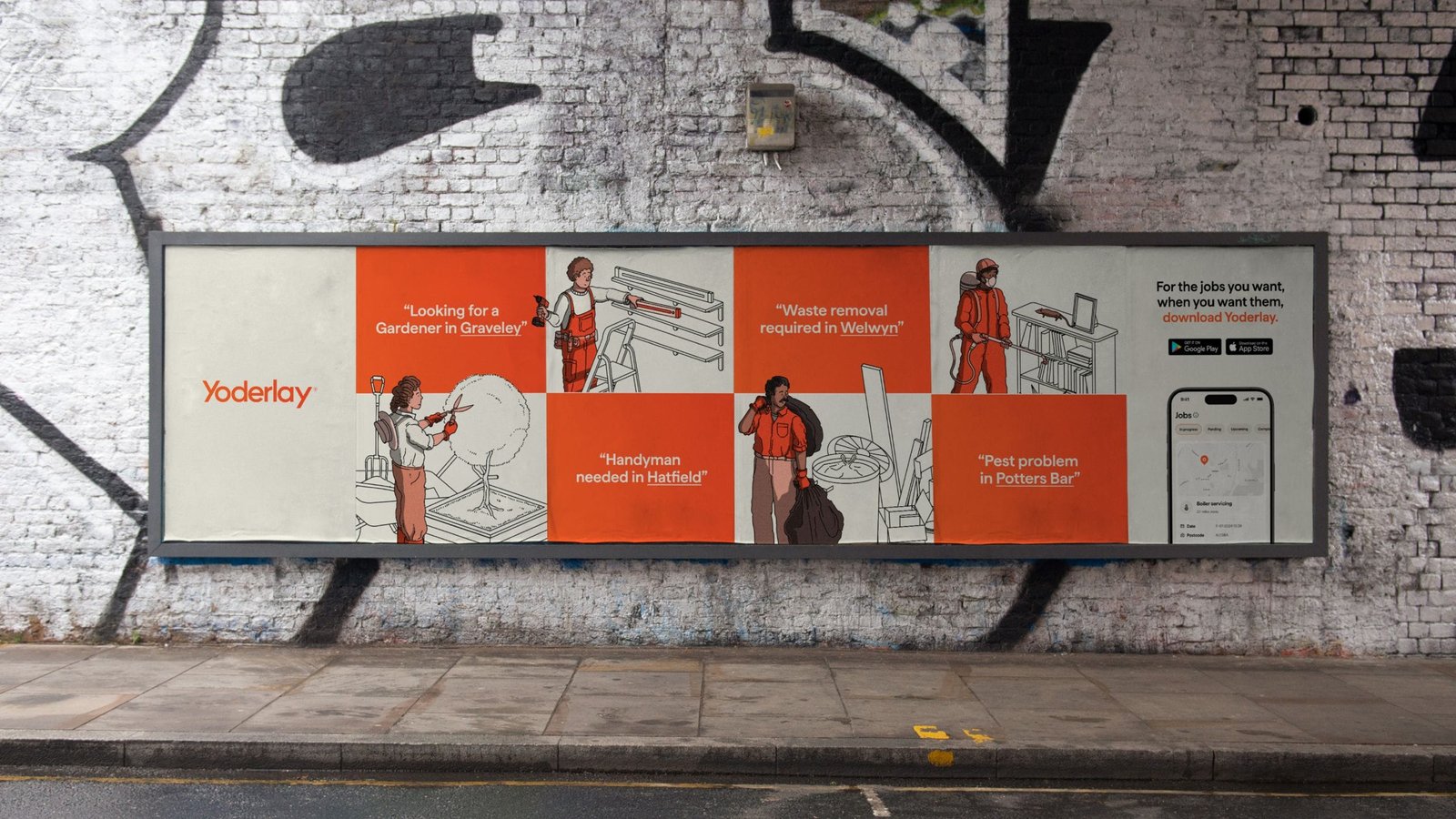
Bespoke Illustrations: Elevating the Brand

One standout feature of Yoderlay is a series of custom illustrations by Doug John Miller, renowned for his work with BAO, Netflix, Nike, and The New York Times. These illustrations, featured prominently across the app and branding, depict intricate scenes while keeping the focus on the people—celebrating the skilled tradespeople at the heart of the service.
“The goal was to highlight the individuals doing the work, not just the tasks being completed,” Power explains.
Miller describes the style as “a balance between clean vector linework and textured, hand-drawn elements.” This approach ensured the illustrations were simple yet distinctive in an industry saturated with polished graphics.
A Bold Yet Familiar Palette

Yoderlay’s color palette was curated to resonate with tradespeople—bold without being overbearing. “For the illustrations, we wanted to limit the palette to create consistency across diverse situations, people, and places,” says Power.
A User-Centric Experience

Simplicity guided the app’s interface design, ensuring users can quickly navigate tasks without frustration. “When you’re dealing with a home emergency, the last thing you need is a clunky interface,” Power emphasizes.
To balance functionality with personality, the team incorporated “celebratory moments” into the UI, featuring playful, illustrative designs for milestones like ‘Job booked’ or ‘Payment received.’
Typography and Wordmark
While the wordmark was already in place when Studio Morfar joined the project, the team opted for Matter, a modern typeface by Displaay Type Foundry, to enhance the app’s approachable and contemporary aesthetic.
With its thoughtful branding, user-first design, and bespoke illustrations, Yoderlay is poised to revolutionize the home services sector.


Explore our collection of inspiring branding projects