Mother Design has unveiled a bold new rebrand for Air Up, blending the vibrancy of childhood with the sophistication of adulthood. This fresh visual identity embraces playful typography, dynamic color gradients, and generative 3D design elements to encapsulate the unique Air Up experience—flavor through scent. The refined brand direction positions Air Up as an aspirational lifestyle brand, appealing to both youthful curiosity and mature sensibilities while preparing for international expansion.
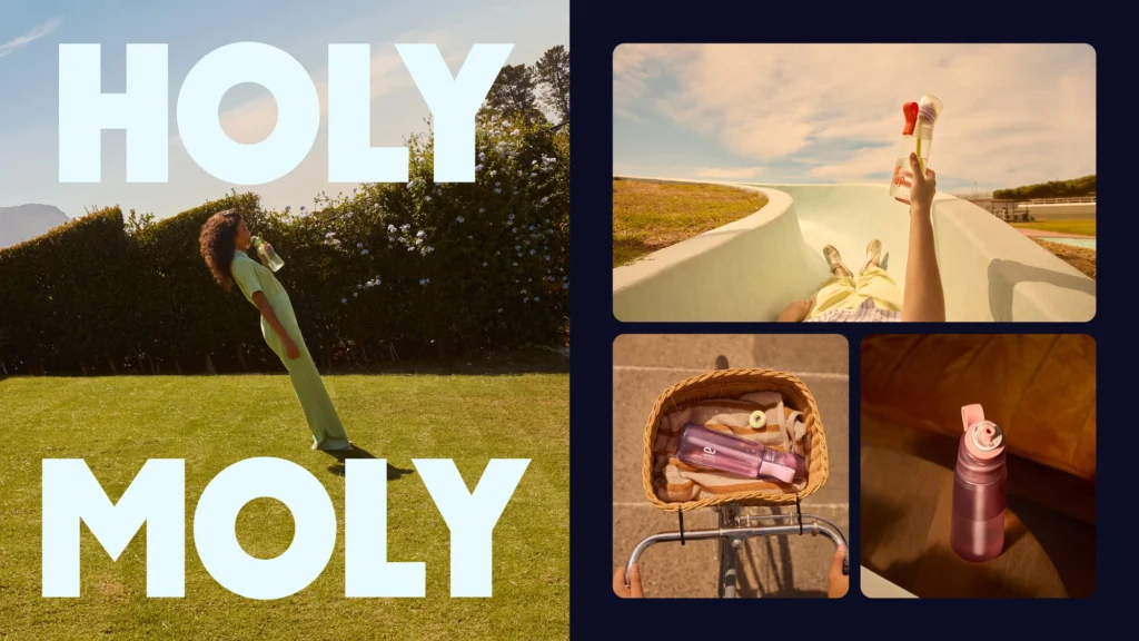


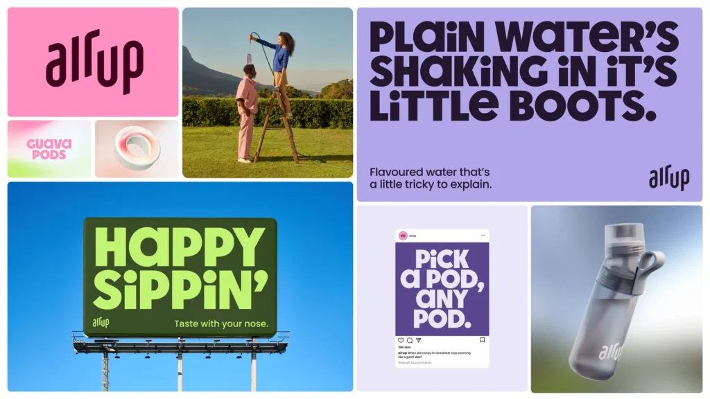


Air Up’s rebrand by Mother Design is a striking fusion of maturity and playfulness, reflecting the brand’s innovative approach to flavored hydration. The new identity introduces Air Up Sans, a custom typeface reminiscent of magnetic fridge letters, paired with a grounded secondary typeface to balance its youthful energy. The color palette, directly inspired by Air Up’s flavors, blends vibrant hues with subtle gradients to create an engaging yet refined aesthetic.
To reinforce the brand’s unique concept—flavor perceived through scent—Mother Design leveraged cutting-edge 3D design tools like Nomad Sculpt and Spline, crafting visuals that embody Air Up’s sensory-driven experience. A refined logo update maintains brand recognition while enhancing clarity and impact.
Beyond packaging and advertising, the new identity extends seamlessly across digital platforms, social media, and branded content. By juxtaposing bold expression with structured simplicity, Air Up’s rebrand resonates with consumers seeking both fun and functionality in their hydration choices.